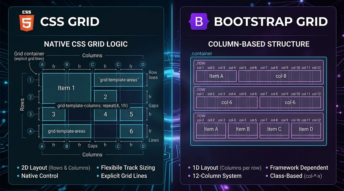
CSS Grid is a native CSS layout system that gives you direct control over rows and columns, while Bootstrap Grid is part of the Bootstrap framework and uses predefined classes for responsive layouts. CSS Grid offers more freedom for custom layouts, whereas Bootstrap Grid is convenient when you already use Bootstrap or want to build conventional responsive layouts quickly.
Neither is universally better. The right choice depends on how much layout control you need, whether your project uses Bootstrap, and how you prefer to handle responsive design.
CSS Grid vs Bootstrap Grid: Quick Comparison
The main difference between CSS Grid and Bootstrap Grid is how they define and control layouts. Here is a quick comparison before looking at each approach in detail.
| Feature | CSS Grid | Bootstrap Grid |
| Type | Native CSS layout system | Grid system within Bootstrap |
| Layout approach | Two-dimensional rows and columns | Responsive column-based layout |
| Grid structure | Fully customizable | Traditionally based on 12 columns |
| Flexibility | High | Structured around Bootstrap conventions |
| Responsive design | CSS features and media queries | Responsive classes and breakpoints |
| HTML/CSS approach | Layout primarily defined in CSS | Grid classes applied in HTML |
| Dependencies | No external framework required | Requires Bootstrap CSS |
| Customization | Fine-grained layout control | Customizable within Bootstrap |
| Learning curve | Requires learning CSS Grid properties | Straightforward if you know Bootstrap |
| Best for | Custom and complex layouts | Rapid Bootstrap-based development |
In simple terms, CSS Grid gives you more direct control over the layout, while Bootstrap Grid provides an established responsive structure that can reduce the amount of layout CSS you need to write.
What Is CSS Grid?
CSS Grid is a browser-native CSS layout system for arranging elements across rows and columns. It is two-dimensional, meaning you can control both dimensions of a layout together instead of focusing primarily on a single axis.
A grid starts by applying display: grid to a container. Properties such as grid-template-columns and grid-template-rows define its structure, while gap controls spacing between tracks. Units such as fr make it easy to distribute available space between columns.
For example, grid-template-columns: repeat(3, 1fr) creates three equal-width columns. If you want to experiment with rows, columns, gaps, and alignment visually, a CSS Grid Generator can help you build the structure and generate the corresponding CSS.
What Is Bootstrap Grid?
Bootstrap Grid is the responsive layout system included with the Bootstrap front-end framework. Its traditional grid organizes content using containers, rows, and a 12-column structure, making it straightforward to create common responsive page layouts.
A typical Bootstrap layout starts with .container or .container-fluid, followed by .row and column classes such as .col, .col-6, or .col-md-4. Responsive classes let columns change width at predefined breakpoints.
For example, three .col-md-4 elements can each occupy four of the 12 available columns from the md breakpoint upward. Bootstrap also provides gutters and responsive utilities that work alongside its grid system.
CSS Grid vs Bootstrap Grid: Key Differences
Although both approaches help organize web layouts, they differ significantly in how much control they provide and where layout rules are defined.
Layout Control and Flexibility
CSS Grid lets you explicitly define rows, columns, track sizes, gaps, and element placement. You are not restricted to a predefined number of columns, which makes Grid particularly useful for layouts with custom proportions or more complex arrangements.
Bootstrap Grid provides an established structure based around responsive column classes. That convention makes many common layouts quick to build, but a highly customized design may require additional CSS.
Responsive Design
CSS Grid gives you control over how the grid responds to available space. Functions such as minmax(), repeat(), auto-fit, and auto-fill can create flexible layouts, while media queries provide additional control when specific breakpoint behavior is required.
Bootstrap takes a breakpoint-driven approach. Classes such as .col-sm-*, .col-md-*, and .col-lg-* let you specify how much space an element occupies at different viewport widths.
HTML and CSS Syntax
With CSS Grid, most layout instructions remain in the stylesheet. HTML elements generally do not need framework-specific classes simply to participate in the grid.
Bootstrap Grid places more layout information directly in the markup through classes such as .container, .row, and .col-md-6. This makes the responsive structure visible in the HTML but also ties that markup to Bootstrap’s conventions.
Customization and Dependencies
CSS Grid is part of CSS itself, so no third-party layout framework is required. Developers can define dimensions, placement, alignment, and responsive behavior according to the specific design.
Bootstrap Grid requires Bootstrap’s relevant CSS and follows the framework’s grid conventions. Bootstrap is customizable, but using its grid also means working within a larger framework ecosystem.
Development Speed
Bootstrap Grid can be efficient for conventional layouts, especially when Bootstrap is already part of the project. Developers familiar with its classes can quickly create responsive rows and columns without defining every layout rule from scratch.
CSS Grid requires you to define the layout yourself, but that becomes an advantage when the design needs precise placement or doesn’t fit neatly into a standard column system.
CSS Grid vs Bootstrap Grid Code Example
The difference becomes clearer when both systems create the same responsive three-column layout.
CSS Grid:
<div class=”grid”>
<div>Column 1</div>
<div>Column 2</div>
<div>Column 3</div>
</div>
.grid {
display: grid;
grid-template-columns: repeat(3, 1fr);
gap: 16px;
}
@media (max-width: 767px) {
.grid {
grid-template-columns: 1fr;
}
}
This creates three equal columns on larger screens and stacks them into one column below 768px.
Bootstrap Grid:
<div class=”container”>
<div class=”row”>
<div class=”col-12 col-md-4″>Column 1</div>
<div class=”col-12 col-md-4″>Column 2</div>
<div class=”col-12 col-md-4″>Column 3</div>
</div>
</div>
Here, each Bootstrap column occupies the full available width on smaller screens and four of the 12 grid columns from the md breakpoint upward.
The CSS Grid version keeps the layout rules primarily in CSS and gives you direct control over the responsive behavior. Bootstrap expresses much of the responsive structure through classes in the HTML and relies on its predefined breakpoint system. Both approaches produce the same basic layout, but they get there in different ways.
When Should You Use CSS Grid?
Choose CSS Grid when you need precise control over rows and columns, custom proportions, or a layout that doesn’t fit a predefined grid convention. It is particularly useful for page sections, dashboards, galleries, card layouts, and other two-dimensional arrangements.
CSS Grid is also a natural choice when your project doesn’t otherwise require Bootstrap. If you’re new to its properties and terminology, a CSS Grid Tutorial for Beginners can help you understand how grid containers, tracks, gaps, and item placement work together.
When Should You Use Bootstrap Grid?
Bootstrap Grid makes sense when your website already uses Bootstrap and you want its responsive layout conventions to remain consistent across the project. Its predefined containers, rows, columns, and breakpoints make conventional layouts relatively quick to implement.
It can also work well for teams already familiar with Bootstrap’s class system or projects that benefit from Bootstrap’s broader collection of components and utilities.
Can You Use CSS Grid With Bootstrap?
Yes. CSS Grid and Bootstrap do not have to be mutually exclusive. A project might use Bootstrap for its broader UI system while using native CSS Grid inside a dashboard, gallery, product section, or another component that needs more precise two-dimensional layout control.
Bootstrap 5 documentation also describes an experimental, opt-in CSS Grid implementation as an alternative to its default grid system. This should not be confused with Bootstrap’s traditional grid approach built around containers, rows, and responsive column classes.
CSS Grid vs Bootstrap Grid: Which Should You Choose?
Choose CSS Grid when you want native CSS, precise row-and-column control, or highly customized two-dimensional layouts. It gives you greater freedom to define the structure around the design instead of adapting the design to predefined grid conventions.
Choose Bootstrap Grid when Bootstrap is already part of your project or its responsive classes help you build standard layouts efficiently. You can also use both: Bootstrap can support the wider interface while CSS Grid handles sections that require more specialized layout control.
The best choice is therefore not about which technology wins overall, but which approach fits the layout and development requirements of your project.