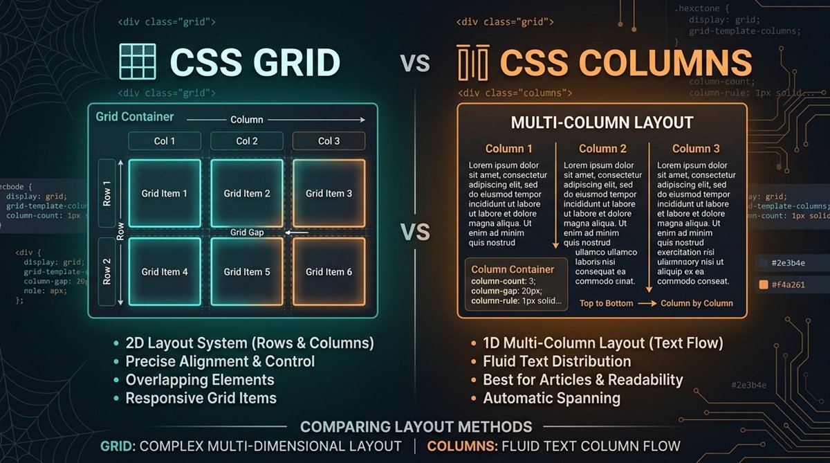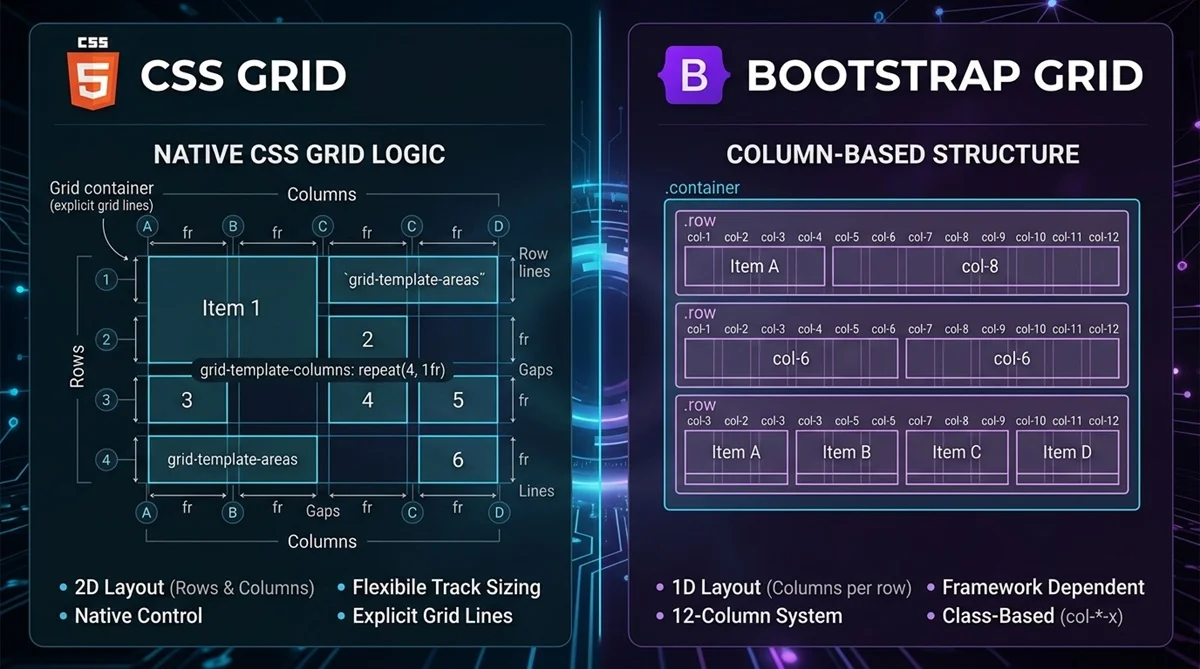
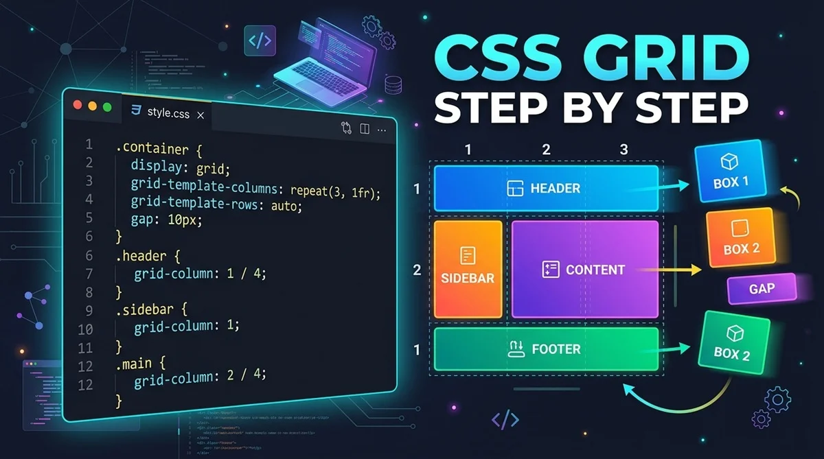
CSS Grid is a two-dimensional CSS layout system that lets you organize elements in rows and columns. It gives you direct control over column sizes, row sizes, spacing, and item placement, making it useful for everything from simple card grids to complete page layouts.
This beginner-friendly tutorial covers the core CSS Grid concepts with practical examples. By the end, you’ll understand how Grid works, how to create rows and columns, position items, and build a responsive grid that adapts to available space.
What Is CSS Grid and Why Is It Useful?
CSS Grid is designed for layouts that need control across both rows and columns. It works well for card grids, product listings, image galleries, dashboards, pricing sections, and larger page layouts.
Instead of manually positioning every element, you define a grid structure and let the browser arrange items within it. You can then control the size, spacing, and placement of individual items when the design requires it.
How Does CSS Grid Work?
A CSS Grid starts with a parent element called the grid container. Adding display: grid to that parent establishes a grid layout for its direct children, which become grid items.
.container {
display: grid;
}
The container defines the overall grid structure, while individual items can be positioned or stretched across specific parts of that grid.
CSS Grid Terminology Every Beginner Should Know
A few terms make CSS Grid much easier to understand:
- Grid container: The parent element with display: grid.
- Grid item: A direct child of the grid container.
- Grid line: A horizontal or vertical line that defines the boundaries of tracks.
- Grid track: The space between two adjacent grid lines, such as a row or column.
- Grid cell: The space where one row and one column intersect.
- Grid area: A rectangular section containing one or more grid cells.
How to Create a CSS Grid Step by Step
Start with a simple HTML container containing three items:
<div class=”container”>
<div>Item 1</div>
<div>Item 2</div>
<div>Item 3</div>
</div>
Now turn the parent into a grid and define three columns:
.container {
display: grid;
grid-template-columns: repeat(3, 1fr);
gap: 20px;
}
display: grid creates the grid container. grid-template-columns defines its column tracks, repeat(3, 1fr) creates three equal flexible columns, and gap: 20px adds consistent spacing between rows and columns.
How CSS Grid Rows, Columns, and the fr Unit Work
Columns are defined with grid-template-columns, while explicit rows can be defined with grid-template-rows.
.container {
grid-template-columns: 200px 1fr 1fr;
grid-template-rows: auto 150px;
}
Here, the first column is fixed at 200px while the remaining columns share the available flexible space. The first row sizes itself according to its content, while the second is set to 150px.
The fr unit represents a fraction of the available flexible space. 1fr 1fr 1fr creates three equal flexible tracks, while 2fr 1fr divides that flexible portion in a 2:1 ratio.
Using repeat(), minmax(), auto-fit, and auto-fill
CSS Grid provides useful functions and keywords for creating flexible layouts without repetitive code. For example:
grid-template-columns: repeat(3, 1fr);
This is a shorter way to define three equal 1fr columns.
For responsive layouts, you can combine repeat(), auto-fit, and minmax():
grid-template-columns: repeat(auto-fit, minmax(200px, 1fr));
minmax(200px, 1fr) allows each track to grow while keeping its minimum size at 200px. auto-fit creates as many tracks as fit and collapses empty repeated tracks, allowing occupied tracks to expand. auto-fill follows a similar fitting process but can retain empty tracks instead of collapsing them.
How to Position and Span Items in CSS Grid
Grid items can span multiple tracks by referencing numbered grid lines.
.item {
grid-column: 1 / 3;
}
The item begins at grid line 1 and ends at line 3, so it spans the two column tracks between those lines.
The same principle works vertically:
.item {
grid-row: 1 / 3;
}
Understanding that these numbers represent grid lines rather than column or row numbers helps avoid a common beginner mistake.
How to Make CSS Grid Responsive
CSS Grid can create many responsive layouts without manually changing the number of columns at several breakpoints. Flexible track sizing lets the browser adjust the layout according to available container space.
.container {
display: grid;
grid-template-columns: repeat(auto-fit, minmax(200px, 1fr));
gap: 20px;
}
On wider containers, more columns can fit on each row. As available space decreases, fewer columns fit. Media queries are still useful when you need broader design changes at specific breakpoints.
Complete Responsive CSS Grid Example
Here is a simple responsive card grid using the concepts covered above:
<div class=”card-grid”>
<div class=”card”>Card 1</div>
<div class=”card”>Card 2</div>
<div class=”card”>Card 3</div>
</div>
.card-grid {
display: grid;
grid-template-columns: repeat(auto-fit, minmax(200px, 1fr));
gap: 20px;
}
The browser fits as many 200px-or-wider tracks as the container allows. When there is less available space, cards automatically move onto additional rows.
Try Your Layout With Our CSS Grid Generator
Once you understand rows, columns, gaps, and track sizing, experiment with these settings visually using our [internal link: CSS Grid Generator]. You can adjust the grid structure, preview the layout, and use the generated CSS in your own project.
This is especially useful when comparing different column structures or spacing values before settling on a final layout.
CSS Grid Properties Cheat Sheet
These properties cover many of the tasks beginners perform when building CSS Grid layouts:
| Property | What It Does |
| display: grid | Creates a grid container |
| grid-template-columns | Defines column tracks |
| grid-template-rows | Defines row tracks |
| gap | Sets spacing between rows and columns |
| grid-column | Controls an item’s column placement or span |
| grid-row | Controls an item’s row placement or span |
CSS Grid vs Flexbox
CSS Grid is especially useful when you need coordinated control over rows and columns. Flexbox is particularly useful when arranging items primarily along one dimension, such as a horizontal navigation menu.
Both are useful CSS layout systems rather than direct replacements for each other. See [internal link: CSS Grid vs Flexbox: What’s the Difference] for a more detailed comparison.
Common CSS Grid Mistakes and How to Fix Them
Beginners commonly run into a few predictable Grid problems:
- Forgetting display: grid: Grid container properties require the parent to establish a grid layout. Check the parent element first when your Grid properties appear to have no effect.
- Mixing container and item properties: Properties such as grid-template-columns define the grid structure on the container, while grid-column and grid-row usually control individual items.
- Confusing tracks with lines: grid-column: 1 / 3 references grid lines. The item therefore spans the tracks between lines 1 and 3.
- Using too many fixed widths: Fixed pixel tracks can cause overflow on narrow screens. Flexible units and minmax() usually make responsive layouts easier to manage.
When Should You Use CSS Grid?
CSS Grid is a strong choice when a design needs organized control across rows and columns. Common examples include card grids, product listings, image galleries, dashboards, pricing sections, and larger page layouts.
For a simple one-dimensional arrangement, such as horizontally aligning navigation items, Flexbox may be more straightforward.
CSS Grid Practice Exercise for Beginners
Try creating a responsive card grid with a 20px gap, a minimum column width of 200px, and a column count that automatically changes according to the available space.
A compact solution is:
.cards {
display: grid;
grid-template-columns: repeat(auto-fit, minmax(200px, 1fr));
gap: 20px;
}
Experiment with the minimum width and gap values to see how they affect the number and size of the columns.