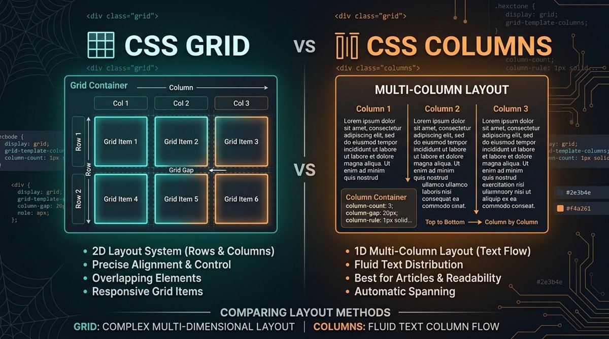
CSS Grid and CSS Multi-column Layout both create column-based designs, but they solve different layout problems. CSS Grid is better when you need structured control over elements across rows and columns, while CSS Columns are designed for continuous content that should flow naturally from one column to another.
For cards, galleries, dashboards, and interface layouts, Grid is usually the better choice. For articles, documentation, lists, and newspaper-style text, Multi-column Layout is often more appropriate.
CSS Grid vs CSS Columns: Quick Comparison
The main difference between CSS Grid and CSS Columns is how they handle content. Grid places elements within a defined layout, while Multi-column Layout flows content through a series of columns.
| Feature | CSS Grid | CSS Columns |
| Main purpose | Structured element layout | Continuous content flow |
| Layout model | Two-dimensional | Multi-column flow |
| Rows | Explicit row control | No direct row structure |
| Columns | Defined grid tracks | Generated column boxes |
| Item placement | Precise control | Content flows automatically |
| Alignment | Extensive item alignment | Limited individual placement |
| Gaps | gap | column-gap |
| Best for | Cards, galleries, dashboards, UI layouts | Articles, lists, documentation, editorial layouts |
If individual elements need to line up in a predictable structure, choose Grid. If the main goal is to divide a continuous piece of content into readable columns, CSS Columns are usually the better fit.
What Is CSS Grid?
CSS Grid is a two-dimensional CSS layout system that lets you organize elements across both rows and columns. A parent becomes a grid container, and its direct children become grid items that can be arranged within grid tracks.
A basic three-column Grid looks like this:
.layout {
display: grid;
grid-template-columns: repeat(3, 1fr);
gap: 1rem;
}
Here, display: grid creates the Grid formatting context, grid-template-columns defines three equal column tracks, and gap adds spacing between them.
If these concepts are new to you, our CSS Grid Tutorial for Beginners explains Grid containers, tracks, rows, columns, and placement from the basics.
What Is CSS Multi-Column Layout?
CSS Multi-column Layout, commonly called CSS Columns or multicol, is designed to flow continuous content across multiple columns. Instead of deliberately placing each element into a particular cell, the browser distributes the content through generated column boxes.
For example:
.article {
column-count: 3;
column-gap: 1.5rem;
}
This divides the article’s content into three columns with space between them. You can also use column-width to specify a preferred column width and let the browser determine an appropriate number of columns.
This makes Multi-column Layout particularly useful for articles, documentation, lists, and magazine or newspaper-style content. It isn’t a simpler version of Grid; it handles a different layout problem.
Key Differences Between CSS Grid and CSS Columns
Understanding how each system treats content makes choosing between CSS Grid and CSS Columns much easier.
Layout Structure
CSS Grid creates an explicit structure made from rows and columns. You can define tracks and control how individual grid items occupy that structure.
Multi-column Layout doesn’t create the same two-dimensional structure. Instead, it divides a continuous flow of content across columns based on properties such as column-count and column-width.
Content Flow
Grid focuses on the placement of elements. Each direct child of a grid container becomes a grid item that participates in the Grid layout.
Multi-column Layout focuses on content flow and fragmentation. Content fills one column and continues into subsequent columns according to the available space and fragmentation rules.
Rows and Columns
Grid provides direct control over both dimensions. Properties such as grid-template-columns and grid-template-rows let you define the horizontal and vertical structure of a layout.
CSS Columns provide columns but not an equivalent system for defining and aligning rows. If elements need to line up consistently across both axes, Grid is generally the more appropriate tool.
Item Placement and Alignment
Grid gives you extensive control over where individual items appear. Items can span tracks, occupy specific grid lines, or be aligned within their grid areas.
Multi-column Layout does not provide comparable control over individual generated column boxes. The browser’s job is primarily to distribute the content through them.
Responsive Layout Control
Both approaches can create responsive layouts, but they do so differently. Grid can combine features such as repeat(), minmax(), and flexible track sizing to adapt a structured layout to available space.
Multi-column Layout can use column-width to allow the browser to adjust how many columns fit. This works especially well when readability and natural content flow matter more than precise component placement.
CSS Grid vs CSS Columns: Practical Examples
Imagine a page containing six product cards. The cards need consistent alignment across rows and columns, so Grid is a natural choice:
.products {
display: grid;
grid-template-columns: repeat(3, 1fr);
gap: 1rem;
}
Now imagine a long article that should read like a magazine. The text needs to continue naturally from one column to the next:
.article {
column-width: 18rem;
column-gap: 2rem;
}
The difference isn’t simply visual. Grid structures separate elements, while Multi-column Layout distributes a continuous content flow.
When Should You Use CSS Grid?
Use CSS Grid when the position and relationship between individual elements matter. Its two-dimensional layout model is especially useful when components must align across both rows and columns.
Typical Grid use cases include:
- Card and product layouts
- Image galleries
- Dashboards
- Application interfaces
- Page sections
- UI components
- Layouts requiring deliberate item placement
- Layouts requiring consistent row and column alignment
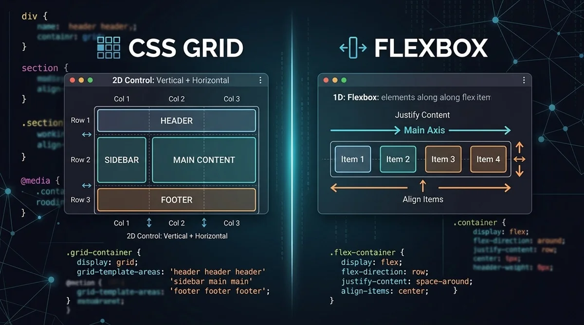
For layouts that primarily run along a single axis, CSS Grid vs Flexbox: What’s the Difference? can help you decide whether Grid or Flexbox better matches the structure you need.
When Should You Use CSS Columns?
Use CSS Multi-column Layout when continuous content should automatically flow between columns rather than when individual elements need precise positions.
It works particularly well for articles, documentation, long lists, directories, and magazine or newspaper-style layouts. For example, a long block of editorial text can automatically continue from the bottom of one column to the top of the next.
One consideration is content fragmentation. Headings, paragraphs, images, and other elements may encounter column breaks, so longer or more complex content sometimes requires additional break-related styling to maintain a readable presentation.
Can You Use CSS Grid and CSS Columns Together?
Yes. CSS Grid and CSS Columns solve different problems, so they can work together within the same design.
For example, Grid might define a page with a main content area and sidebar. The article inside the main Grid item could then use Multi-column Layout to divide long-form text into multiple columns. Grid handles the overall structure, while multicol handles the internal content flow.
CSS Grid vs CSS Columns: Which Should You Choose?
Choose based on what the content needs to do rather than whether the design happens to contain visible columns.
Choose CSS Grid when:
- You need control over rows and columns.
- Individual elements require deliberate placement.
- Components must align with one another.
- You’re building cards, galleries, dashboards, or structured interfaces.
Choose CSS Columns when:
- Continuous content should flow between columns.
- You’re creating an article or editorial layout.
- Precise placement of individual column boxes isn’t required.
- You want magazine or newspaper-style text.
Use both when the outer interface requires a structured Grid while content within part of that Grid needs multi-column flow.
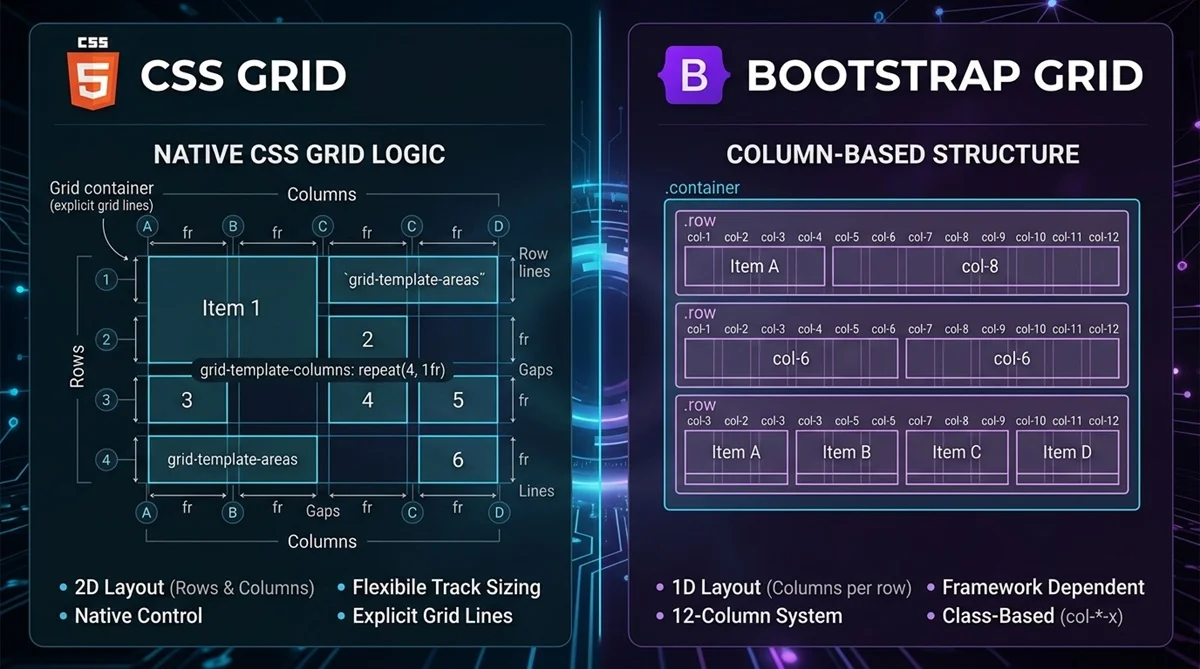
If you’re comparing Grid with framework-based layout systems as well, see CSS Grid vs Bootstrap Grid: What’s the Difference? for the practical differences between native CSS Grid and Bootstrap’s grid approach.
Build Your Layout With a CSS Grid Generator
If CSS Grid is the right choice for your project, you don’t have to experiment with every property manually. A CSS Grid Generator lets you visually configure the layout and see the resulting CSS as you make changes.
You can adjust rows, columns, gaps, and the overall Grid structure, preview the result, and then copy the generated CSS into your project. This is especially useful when testing different Grid configurations before settling on the final layout.