Creating stylish and professional buttons is an important part of modern web design. A CSS Button Generator helps you design custom buttons visually and generate clean CSS code without writing everything from scratch.
Whether you’re a beginner building your first website or an experienced developer creating user interfaces, our CSS Button Generator makes button creation faster, easier, and more efficient. Customize colors, typography, borders, shadows, and hover effects, then copy the generated code instantly.
A CSS Button Generator is a visual tool that allows you to create custom button styles and automatically generate the CSS code needed to use them on your website.
Instead of manually adjusting dozens of CSS properties, you can simply choose your preferred settings and preview the changes in real time. This saves development time and helps maintain design consistency across projects.
Designing a custom button takes only a few simple steps.
Step 1: Enter Your Button Text
Start by adding the text you want your button to display.
Examples:
Step 2: Choose Your Colors
Select a background color and text color that match your website branding.
Make sure the text remains easy to read against the chosen background.
Step 3: Adjust Typography
Customize:
Typography plays a major role in readability and user engagement.
Step 4: Configure Borders and Border Radius
Choose whether your button should have:
Step 5: Add Shadows and Effects
Enhance visual appeal using:
Step 6: Preview the Button
The live preview updates automatically so you can see exactly how your button will appear.
Step 7: Copy the Generated CSS
Once you’re satisfied with the design, simply copy the generated code and paste it into your project.
Buttons are created using HTML and styled using CSS.
HTML Button Element
A basic button starts with HTML:
<button>Get Started</button>
This creates a functional button, but it lacks visual styling.
CSS Styling
CSS controls the appearance of the button.
Properties such as colors, typography, borders, spacing, and shadows define how the button looks.
Hover States
Hover states activate when users place their cursor over a button.
These effects provide visual feedback and improve user experience.
Focus States
Focus states help keyboard users navigate a website more easily.
They are an essential part of accessible web design.
Active States
Active states indicate that a button is being clicked or pressed.
This creates a more interactive experience.
Understanding common CSS properties helps you create better button designs.
Background Color
The background color is the main visual element of a button.
Use colors that align with your brand while maintaining strong contrast.
Text Color
Text should always remain readable.
High contrast between text and background improves accessibility and usability.
Typography Settings
Typography includes:
Clear typography helps users quickly understand the button’s purpose.
Border and Border Radius
Borders define the outer edge of a button.
Border radius controls how rounded the corners appear.
Popular styles include:
Box Shadow
Box shadows add depth and create a modern appearance.
They help buttons stand out from surrounding content.
Text Shadow
Text shadows add subtle visual enhancement and can improve readability in certain designs.
Hover Effects
Hover effects make buttons feel interactive.
Common hover effects include:
CSS Transitions
Transitions create smooth animations between states.
Instead of an instant change, users experience a polished visual effect.
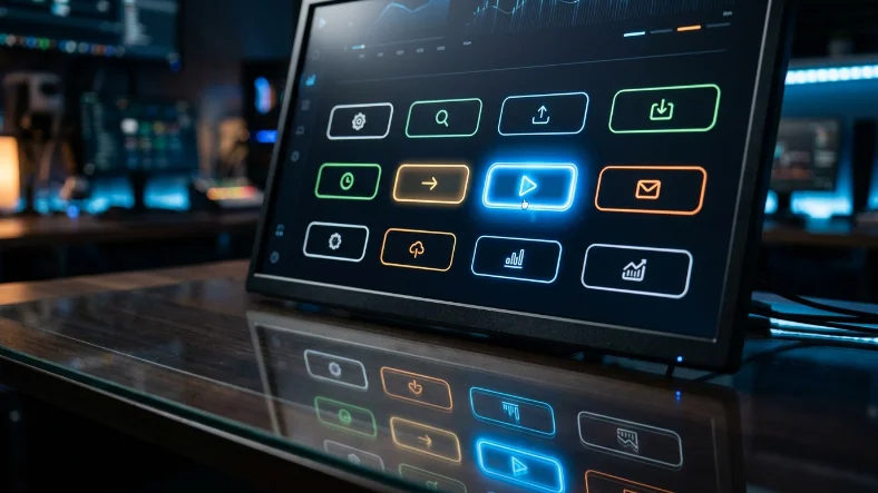
Different websites require different button styles.
Primary Buttons
Primary buttons highlight the most important action on a page.
Examples:
Secondary Buttons
Secondary buttons support less important actions.
Examples:
Outline Buttons
Outline buttons use transparent backgrounds and visible borders.
They create a clean and minimalist appearance.
Ghost Buttons
Ghost buttons are lightweight and visually subtle.
They are commonly used in modern landing pages.
Gradient Buttons
Gradient buttons use multiple colors to create visual interest.
These buttons often attract more attention than flat-color designs.
Glassmorphism Buttons
Glassmorphism uses transparency and blur effects to create a modern frosted-glass appearance.
Popular among SaaS products and dashboards.
Neumorphism Buttons
Neumorphism creates a soft, realistic design using subtle shadows and highlights.
This style remains popular in modern UI concepts.
Animated Buttons
Animated buttons increase user engagement through motion.
Examples include:
Great button design is about more than appearance.
Maintain High Contrast
Users should be able to read button text instantly.
Avoid low-contrast color combinations.
Create Clear Visual Hierarchy
Important actions should receive more visual emphasis than secondary actions.
Use size, color, and positioning strategically.
Use Consistent Styling
Consistent buttons create a more professional user experience.
Maintain similar colors, spacing, and typography throughout your website.
Optimize for Mobile Devices
Buttons should be easy to tap on smaller screens.
Larger touch areas improve usability and reduce frustration.
Keep Designs Simple
Simple buttons often perform better than overly complex designs.
Focus on clarity and usability.
A Call-to-Action (CTA) button encourages users to take a specific action.
Signup Buttons
Signup buttons should be visually prominent and use action-focused text.
Examples:
Buy Now Buttons
Buy Now buttons should communicate urgency and confidence.
Examples:
Download Buttons
Download buttons should clearly communicate value.
Examples:
Contact Buttons
Contact buttons help generate inquiries and leads.
Examples:
CTA Design Tips
Responsive buttons adapt to different screen sizes automatically.
Why Responsiveness Matters
More users browse websites on mobile devices than ever before.
Buttons that work well on desktop but fail on mobile can reduce conversions.
Recommended Button Sizes
For touch-friendly interfaces, buttons should be large enough to tap comfortably.
Avoid tiny buttons that frustrate users.
Touch Target Guidelines
Industry guidelines recommend adequate spacing around buttons to prevent accidental clicks.
Flexible Width Buttons
Responsive buttons can expand or shrink depending on available screen space.
This improves usability across all devices.
Accessible buttons help everyone use your website effectively.
Add Visible Focus States
Users navigating with keyboards need a clear indication of focus.
Always provide a visible focus outline.
Use Accessible Color Combinations
High contrast improves readability for users with visual impairments.
Support Keyboard Navigation
Buttons should be fully usable without a mouse.
Improve Screen Reader Compatibility
Use descriptive button text that clearly explains the intended action.
Avoid vague labels such as “Click Here.”
Simple Button Example
.button {
background-color: #2563eb;
color: white;
padding: 12px 24px;
border: none;
border-radius: 6px;
}
A simple and effective button suitable for most websites.
Gradient Button Example
.button {
background: linear-gradient(90deg, #2563eb, #7c3aed);
color: white;
}
Creates a modern gradient appearance.
Hover Effect Example
.button:hover {
background-color: #1d4ed8;
}
Provides visual feedback during interaction.
Animated Button Example
.button {
transition: all 0.3s ease;
}
.button:hover {
transform: scale(1.05);
}
Adds a smooth hover animation.
CTA Button Example
.button {
background-color: #22c55e;
color: white;
font-weight: bold;
}
Ideal for conversion-focused actions.
Manual CSS coding can be time-consuming.
A CSS Button Generator simplifies the process by allowing you to design visually and generate code automatically.
Save Development Time
Create buttons in minutes instead of manually testing multiple CSS properties.
Reduce Coding Errors
Visual controls reduce the likelihood of syntax mistakes.
Improve Productivity
Spend more time building projects and less time adjusting styles.
Better Design Workflow
Instant previews make experimentation easier.
Useful for All Skill Levels
Beginners can create professional buttons quickly, while developers can accelerate workflow.
Poor Color Contrast
Low contrast makes buttons difficult to read.
Always prioritize readability.
Tiny Buttons
Small buttons are difficult to click, especially on mobile devices.
Excessive Animations
Too many effects can distract users and reduce performance.
Inconsistent Styling
Using multiple button styles without a system creates confusion.
Missing Hover States
Buttons should always provide interaction feedback.
Missing Focus States
Ignoring keyboard users negatively impacts accessibility.
To create even more advanced UI elements, you may also find these tools useful:
These tools work together to help you build modern, responsive interfaces faster.
A CSS Button Generator makes creating professional, responsive, and visually appealing buttons easier than ever. Instead of manually writing CSS, you can customize colors, typography, borders, shadows, and hover effects through an intuitive interface and generate production-ready code instantly.
Whether you’re designing landing pages, web applications, online stores, or business websites, a CSS Button Generator helps streamline development, improve consistency, and create better user experiences.
A CSS Button Generator is a tool that helps users visually create buttons and generate CSS code automatically.
Yes. Most CSS Button Generators allow users to create and copy CSS code without cost.
Hover effects apply styling changes when users move their cursor over a button.
Yes. Responsive button styles adapt automatically to different screen sizes.
Yes. Generated CSS can be integrated into virtually any frontend framework.
Buttons should be large enough for comfortable interaction on both desktop and mobile devices.
Use CSS gradients or generate them instantly using a CSS Button Generator.
Use high contrast colors, visible focus states, keyboard support, and descriptive button text.