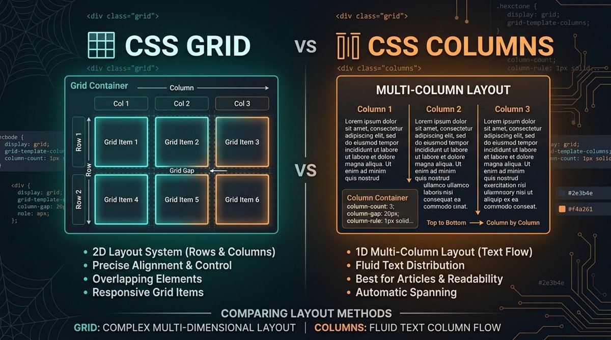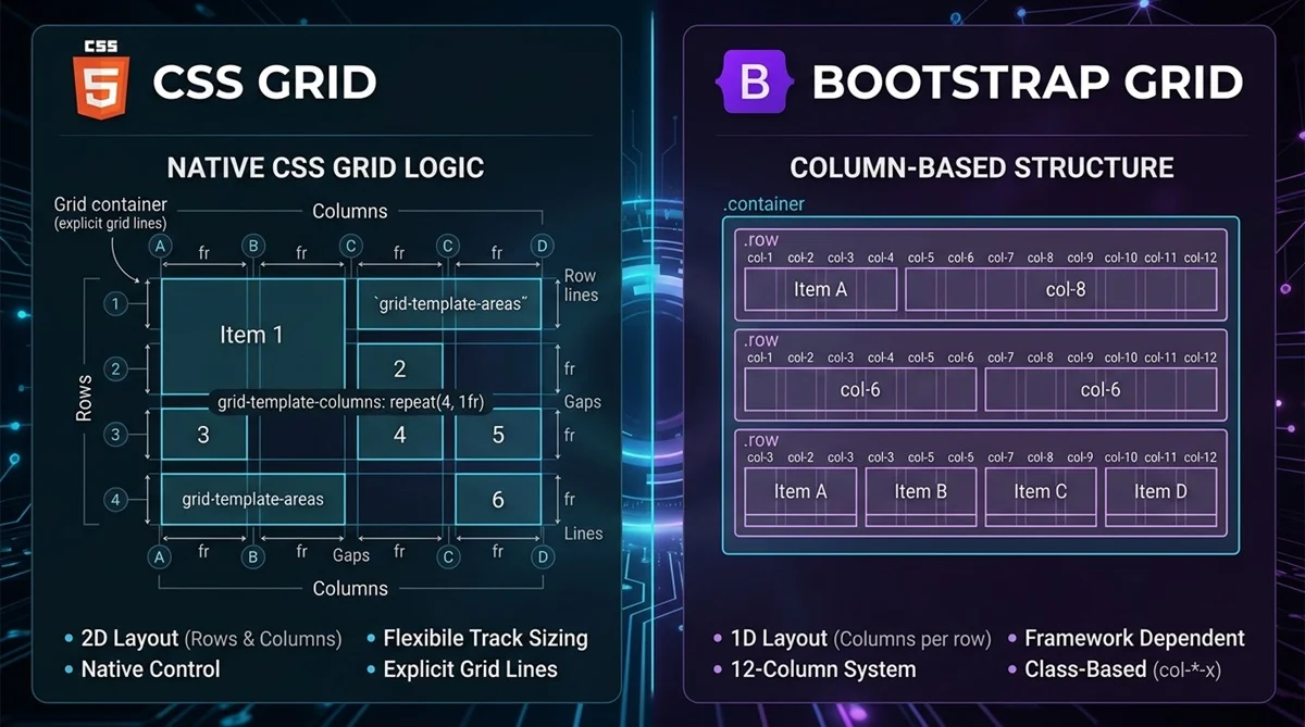
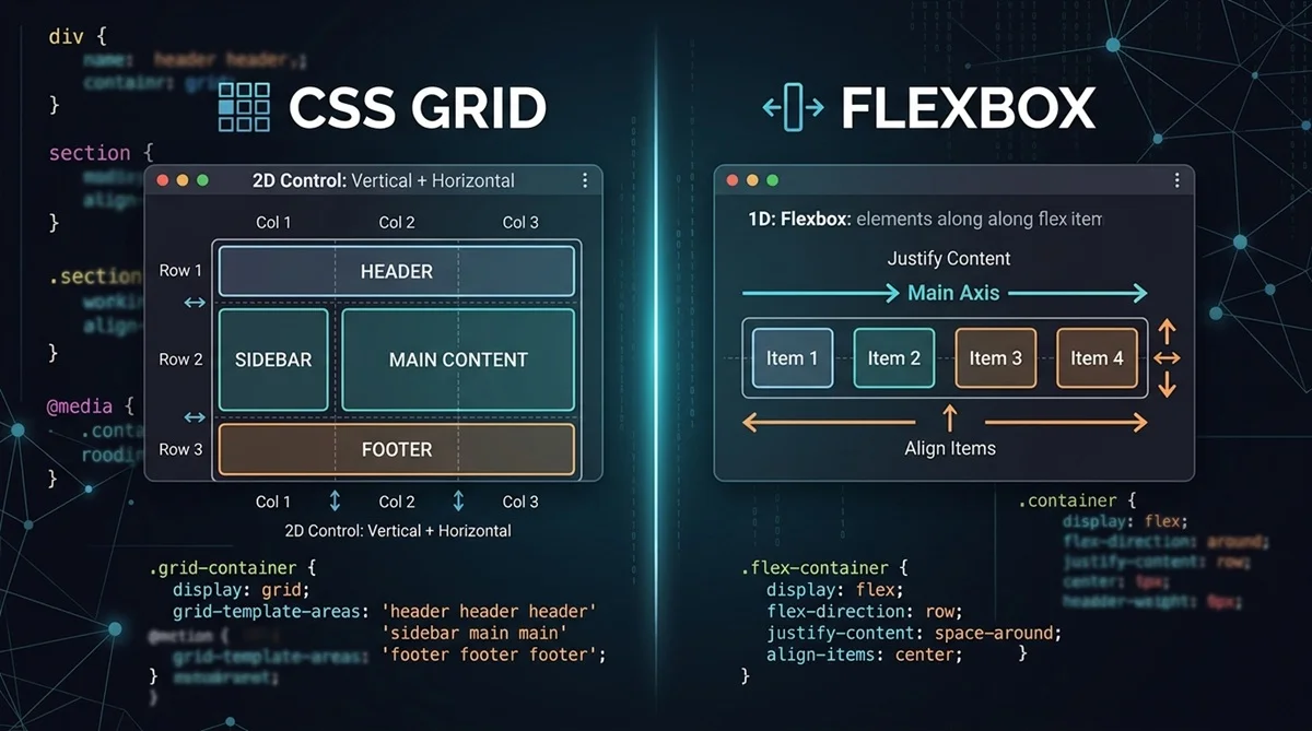
CSS Grid and Flexbox are both powerful CSS layout systems, but they solve different problems. Flexbox is primarily one-dimensional, making it ideal for arranging items in a row or column. CSS Grid is two-dimensional, giving you coordinated control over rows and columns. Neither is universally better, and many modern layouts use both together.
CSS Grid vs Flexbox: Quick Comparison
The easiest way to understand the difference is to compare how each layout system handles structure and alignment.
| Feature | CSS Grid | Flexbox |
| Dimensions | Two-dimensional | One-dimensional |
| Layout Control | Rows and columns | Row or column |
| Layout Approach | Often layout-driven | Often content-driven |
| Item Placement | Precise row and column placement | Flexible placement along an axis |
| Wrapping | Items align to shared grid tracks | Wrapped flex lines behave independently |
| Best For | Structured 2D layouts | 1D alignment and distribution |
| Common Uses | Card grids, galleries, dashboards | Navbars, buttons, toolbars |
These are practical guidelines rather than strict rules. The best choice depends on how you want the content to behave as the container and screen size change.
What Is CSS Grid?
CSS Grid is a two-dimensional layout system for organizing elements across rows and columns. Setting display: grid on a container creates a grid formatting context where you can define tracks, gaps, and item placement.
For example:
.container {
display: grid;
grid-template-columns: repeat(3, 1fr);
gap: 16px;
}
Here, repeat(3, 1fr) creates three equal columns, while gap adds consistent spacing between them. Grid also provides tools such as grid-template-rows, minmax(), and fractional (fr) units for building flexible layouts.
If these concepts are new to you, our CSS Grid Tutorial for Beginners explains Grid step by step.
What Is Flexbox?
Flexbox is a one-dimensional layout system designed to arrange and align items primarily along a single axis. A flex container can organize its children horizontally or vertically and distribute available space between them.
A basic Flexbox layout looks like this:
.container {
display: flex;
justify-content: space-between;
align-items: center;
gap: 16px;
}
The flex-direction property determines the main axis, while justify-content controls alignment along that axis and align-items handles alignment across the cross axis. flex-wrap allows items to continue onto additional lines when space becomes limited.
CSS Grid vs Flexbox: Key Differences Explained
The difference goes beyond simply saying that Grid has rows and columns. Understanding how each system approaches layout makes choosing between them much easier.
One-Dimensional vs Two-Dimensional Layout
Flexbox primarily works along one axis at a time. With flex-direction: row, items flow horizontally; with flex-direction: column, they flow vertically.
Grid controls two dimensions together. You can define both columns and rows and place elements according to that shared structure. This makes Grid especially useful when horizontal and vertical alignment both matter.
Content-Driven vs Layout-Driven
Flexbox is commonly content-driven. The size and number of flex items influence how available space is distributed, making it useful when the content itself should help determine the arrangement.
Grid makes it easier to take a layout-driven approach. You can establish columns and rows first, then allow content to occupy those tracks. This provides greater structural control for layouts such as dashboards and galleries.
Rows and Columns
Flexbox can create multiple lines with flex-wrap, but those lines do not become a coordinated two-dimensional grid. Each flex line distributes its available space independently.
Grid creates shared tracks. Items in different rows can therefore align to the same columns, which is useful when consistent alignment across multiple rows matters.
Alignment and Spacing
Grid and Flexbox share several alignment capabilities. Both support properties such as gap, justify-content, and align-items in applicable layout contexts, so basic spacing or alignment alone does not always determine which one you should choose.
Instead, think about the structure. If you’re primarily distributing items along one axis, Flexbox is often simpler. If alignment must remain coordinated across rows and columns, Grid is usually a stronger starting point.
Item Placement and Control
Grid provides explicit control over where items sit within a two-dimensional structure. For example:
.featured {
grid-column: 1 / 3;
}
This allows an item to span two grid columns without restructuring the surrounding elements.
Flexbox generally works better when items should follow their natural sequence and adjust flexibly according to available space.
Responsive Layouts
Both CSS Grid and Flexbox work well for responsive design. Flexbox can wrap and resize content as available space changes, while Grid provides features such as repeat(), minmax(), and flexible tracks.
For example, a responsive Grid can be created with:
grid-template-columns: repeat(auto-fit, minmax(200px, 1fr));
The right choice depends on the desired layout behavior, not simply whether the design needs to be responsive.
When Should You Use CSS Grid?
Use CSS Grid when you need coordinated control over rows and columns. It is particularly useful when elements need to follow a consistent two-dimensional structure.
Common Grid use cases include:
- Card and product grids
- Image galleries
- Dashboards
- Page sections
- Aligned form layouts
- Interfaces with structured rows and columns
When you already know Grid is the right approach, the CSS Grid Generator lets you visually create columns, rows, gaps, and other Grid settings and generate the corresponding CSS.
When Should You Use Flexbox?
Use Flexbox when elements primarily need to align, resize, or distribute along one axis. It is especially convenient for smaller groups of content whose size may vary.
Common examples include navigation menus, button groups, toolbars, horizontal lists, form controls, and alignment inside individual UI components.
For these layouts, the CSS Flexbox Generator provides a visual way to experiment with direction, alignment, wrapping, and spacing.
CSS Grid vs Flexbox Examples
Consider a layout containing three cards. Grid can define three coordinated columns directly:
.cards {
display: grid;
grid-template-columns: repeat(3, 1fr);
gap: 16px;
}
The same cards can also be arranged with Flexbox:
.cards {
display: flex;
flex-wrap: wrap;
gap: 16px;
}
.card {
flex: 1 1 30%;
}
Neither example is automatically better. Grid expresses the three-column structure directly, while Flexbox allows the cards to size and flow based on the available space. Choose according to the behavior the interface requires.
Can You Use CSS Grid and Flexbox Together?
Yes. CSS Grid and Flexbox complement each other and are frequently useful within the same interface. You might use Grid for the overall page structure and Flexbox for aligning content inside individual components.
For example:
.page {
display: grid;
grid-template-columns: 240px 1fr;
gap: 24px;
}
.navigation {
display: flex;
align-items: center;
gap: 12px;
}
Here, Grid controls the larger two-column structure while Flexbox handles one-dimensional alignment inside the navigation.
CSS Grid or Flexbox: Which Should You Choose?
A simple rule is to start with Flexbox when the problem is mainly one-dimensional and Grid when rows and columns need to work together. Use both when different parts of the interface have different layout requirements.
| Layout Scenario | Starting Point | Why |
| Navigation bar | Flexbox | Primarily one-axis alignment |
| Button group | Flexbox | Simple item distribution |
| Toolbar | Flexbox | Flexible content alignment |
| Card grid | CSS Grid | Coordinated rows and columns |
| Image gallery | CSS Grid | Structured 2D arrangement |
| Dashboard | CSS Grid | Row and column control |
| Page structure | CSS Grid | Larger two-dimensional layout |
| Cards with internal alignment | Grid + Flexbox | Grid outside, Flexbox inside |
Treat these recommendations as starting points, not fixed rules. The correct choice ultimately depends on how your content needs to flow, align, and respond to changing space.
Common CSS Grid and Flexbox Mistakes
Choosing the right system becomes easier when you avoid a few common misconceptions.
- Forcing Flexbox into a strict 2D layout: Flexbox can wrap, but Grid is usually clearer when several rows need to stay aligned with the same columns.
- Assuming flex-wrap works like Grid: Wrapped flex lines calculate their available space independently, whereas Grid items participate in shared tracks.
- Using Grid for every alignment task: A simple row of buttons or navigation links usually does not require a two-dimensional grid structure.
- Thinking Grid is only for pages: Grid also works well for smaller components when those components genuinely require row-and-column control.
- Treating Grid and Flexbox as competitors: You do not need to choose one technology for an entire project. Combining them is often the cleanest approach.
- Relying on unnecessary fixed dimensions: Flexible tracks, wrapping, and content-aware sizing usually produce layouts that adapt more gracefully across screen sizes.