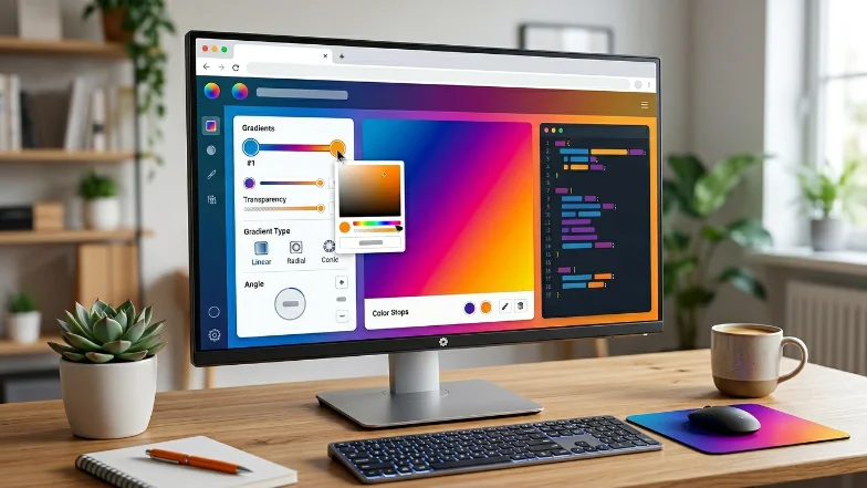
Generate beautiful CSS gradients instantly with our free online tool. Preview gradients live and copy the CSS code with one click to use directly on your website. Perfect for web designers, developers, and beginners.
Pro Tips:
Linear gradients transition colors in a straight line. You can control the direction with angles or keywords like to right.
Example:
background: linear-gradient(to right, #ff7e5f, #feb47b);
Radial gradients radiate from the center (or specified point) outward. Perfect for circular or elliptical backgrounds.
Example:
background: radial-gradient(circle, #43cea2, #185a9d);
Conic gradients rotate around a center point, creating pie-like patterns. Useful for charts, visual effects, or modern UI.
Example:
background: conic-gradient(from 90deg, #f6d365, #fda085, #f6d365);
Repeating gradients allow a pattern to repeat infinitely across a surface. Ideal for stripes or patterned backgrounds.
Example:
background: repeating-linear-gradient(45deg, #6a11cb, #2575fc 50px);
Example – Multi-Color Linear Gradient:
background: linear-gradient(135deg, #ff7e5f, #feb47b, #86fde8);
Example – Radial Gradient with HSL Colors:
background: radial-gradient(circle, hsl(200, 100%, 50%), hsl(340, 80%, 60%));
Visual examples make it easy to see the effect of different gradients in real-time.
Experiment with our curated presets or create your own gradient palette to match your design style.
Yes! Add multiple color stops to create gradients with three or more colors.
Absolutely. Select the radial gradient type to create circular or elliptical effects.
Yes, click the “Copy CSS” button and paste it into your stylesheet or inline style.
Yes! The CSS Gradient Generator is completely free and requires no registration.
Yes, you can set any angle from 0° to 360° for linear and conic gradients.